

The bathroom is probably one of the most difficult rooms to access. Renovating them will not only put a strain on your time and budget, but it will also cause the room to become unusable when the work is done. No one wants to renovate their bathroom frequently, so many people are afraid to use color – what happens if the color you choose is no longer popular and affects the value of your home? But white isn’t the only way to downplay the risks. Here are six color combinations that are always winners.
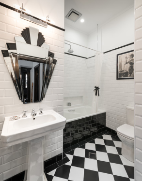
1. Black and white. It is a classic combination that became very popular during the Art Deco period of the 20s and 30s of the 20th century. The old black-and-white geometry on the floors and walls has stood the test of time. With checkerboard tiles, chrome fixtures, and silver-framed mirrors, you’ll have a look as stylish as it was back then.
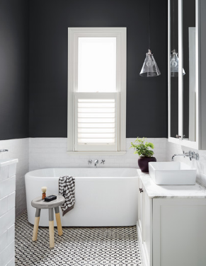
Modern bathroom design is just as good as monochrome color schemes and Art Deco bathroom design. The charcoal wall adds some dramatic style to this bathroom in Melbourne, Australia.
How: Spice it up with some bold red or yellow towels and accessories.
Don’t: Make things too hectic or fussy.
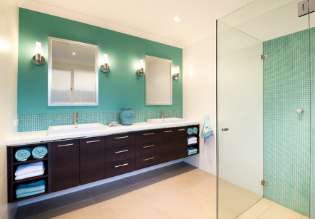
2. Aqua, chocolate and white. This combination is a good balance between tradition and modernity. Use aqua green and white to make the room feel cool and airy, then add a dark chocolate vanity and beige floors to create warmth. If you want a spa-like feel, this combination is a classic. Add aqua and white towels for a luxurious touch.
What to do: Check the position of the light to make sure it doesn’t shine an unsightly blue-green light on your skin.
Don’t: Use too much chocolate. Overindulgence is never a good thing.
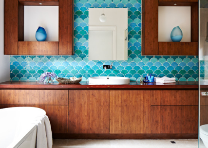
Natural wood can use this foolproof color combination just like chocolate. Camila Moldes’ design for this bathroom may be bold, but it will never go out of style.
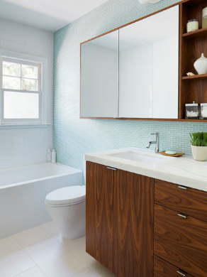
If aqua green is a little too much for you, why not stick with the same color scheme but tone it down a level or two?
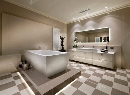
3. Mocha and milky white. Mocha tones make this bathroom warm and inviting. Start your palette with a mocha and milky white, then layer through a variety of espresso-style shades to create some movement and depth. Keep in mind that darker shades will move forward and lighter shades will go back. Use color blocks to highlight areas such as bathtubs to provide interest and direction within the room.
How: Use a prominent dark tone, such as the one under the tub, to base and unify the color scheme.
Don’t: Add any bold or bright colors. They won’t accept this softer aesthetic.
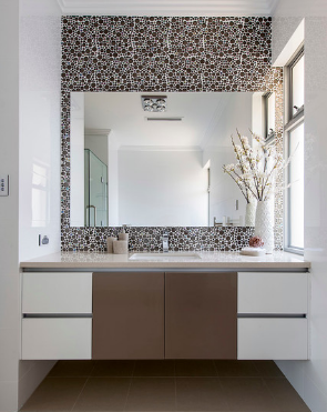
If you want to keep the bathroom a little cooler and milky white isn’t for you, use a refreshing white. Contrast it with the rich, warm mocha on the floor and highlight the dressers and walls.
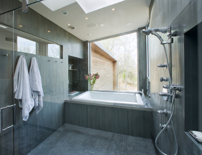
4. Monochrome gray. To create a clean and clean look, add a variety of gray tones to keep your bathroom flowing and providing depth and direction. Add some flowers or lush leafy potted plants, and you’ll create a beautiful, classic setting.
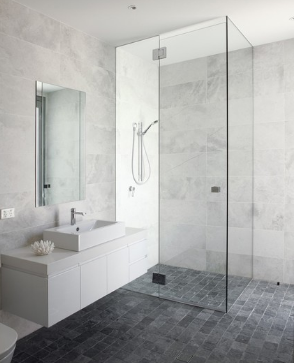
Carrara marble was first used in ancient Rome and has since been used in many famous monuments and buildings. The gray and white veins of marble give any bathroom a luxurious look. What should be done: If Carrara marble is out of your price range, choose a quartz product that looks similar. Don’t do it: If you find gray frustrating rather than soothing or uplifting, use gray.
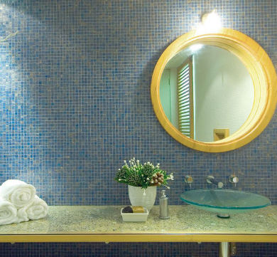
5. Blue and yellow. If you have doubts about effective color combinations, focus on nature. Blue and yellow are a classic combination, similar to the sun rising in a clear blue sky.
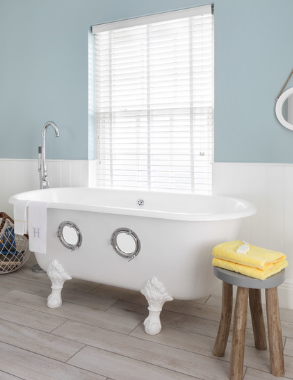
To create a cool feel, use sky blue or ocean blue as the main color and bright yellow for emphasis.
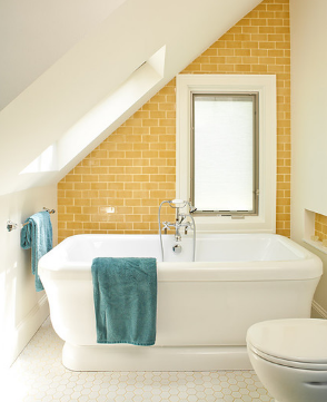
To make your bathroom a little warmer, choose yellow as the main color of tiles or paint and emphasize it with blue. Given its sunny character, this combo is perfect if you’re staying near the water.
What should be done: Consider using traditional blue mosaic tiles, which never seem to get stale.
Don’t: Overuse yellow as it can become overbearing, especially in small rooms.
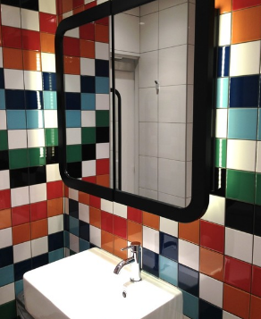
6. Double complementary color. In color theory, this scheme works. A pair of complementary colors (colors that are opposite each other on the color wheel, such as blue and orange) work well with another set of complementary colors (red and green in this case). The result is called a bi-complementary color scheme.
Add black and white to balance the colors, and you’ll create a stunning bathroom. This combination is not for the faint of heart, but if executed properly, it will certainly go far.
Do: Be strategic with the placement of colors to ensure a cohesive scheme.
Don’t do it: if you’re not wholeheartedly enjoying it, use this color combination – it won’t go out of style, but you might get tired of it.